

What a first half it’s been. We had a war, an oil spike, a 9% pullback, a furious rally, a bull market that keeps getting called old, and an AI trade that keeps getting even more interesting (and confusing). But despite all the noise, the S&P 500 still powered to a 10.2% gain in the first six months of 2026.
To mark the halfway point, members of the Carson Investment Research team tackled a simple question: What is your favorite chart that tells the story of the first half of 2026? Here’s a selection of responses.
This Is Just Another Typical President Trump Year
Ryan Detrick, Chief Market Strategist, kicks us off with the big picture, and it’s a great chart:
“It amazes me how this year looks like your average year under President Trump. Early weakness is common; panic and worry take over; long-term bullish strategists start cutting targets and talking about bad things on TV; then stocks bottom in late March/early April and rally for the rest of the year. Once again this year, it all happened: We had a perfectly normal 9.1% pullback in the S&P 500, yet the panic over higher oil prices and the war in Iran was off the charts. Then, sure enough, many investors once again expected the worst and missed out on huge gains.”
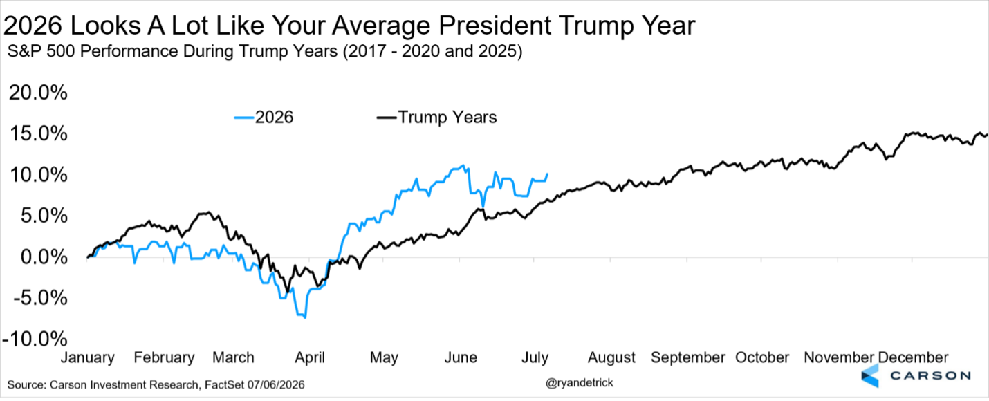
If you overheard the conversations in March and then looked at this chart today, you’d have a hard time believing they described the same market.
Year Six Has Been Very Strong for the Bulls
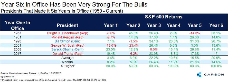
Ryan liked this exercise so much that he couldn’t stop at one chart, so here’s a bonus from him before we move on:
“Yes, everyone is aware that midterm years historically aren’t that great for stocks. But as we’ve noted many times, it’s in the first terms when the trouble tends to happen. Looking at every president since 1950 who made it to a sixth year in office, the S&P 500 finished year six higher every single time, up nearly 21% on average, and never lower for the previous five presidents. History is a guide, not gospel, but it’s one more reason we don’t think the bulls are done in 2026.”
The Inflation Problem Is Bigger Than Oil
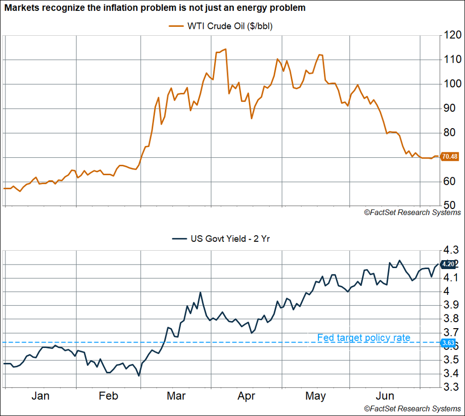
Of course, the reason March felt so scary was what was happening in the oil market. Sonu Varghese, Chief Macro Strategist, picked a chart that tells the more subtle macro story of the half:
“The most striking chart for me shows the movement of oil prices and the two-year Treasury yield in 2026. Oil prices are currently around $70/barrel (WTI), only slightly higher than the $67/barrel on the eve of the Iran war (February 27). Prices have plunged from peak levels above $110/barrel in April. Yet the two-year yield, which is an average estimate of the Fed’s policy rate over the next two years, has continued to climb, and at 4.20% is sitting at the highest level we’ve seen since early 2025. That’s well above the Fed’s current policy rate of 3.6%—telling us that markets expect the Fed to raise rates sooner rather than later and keep them elevated. That’s a huge shift from where we were at the start of the year, when the market expected several rate cuts.
“In other words, the market has increasingly recognized that the inflation problem goes beyond energy, which is why short-term rates have continued to climb despite oil prices making a round trip. Inflationary pressures are broad-based, including AI-related bottlenecks, tariffs, and non-housing services. Most Fed members are clearly hoping the inflation problem is ‘transitory’ (once again), but if it doesn’t prove so and inflation remains elevated, we could see a rush to raise rates. That could result in rough sailing for this bull market as we get into its fifth year (after October).”
The AI Trade Moves to Memory
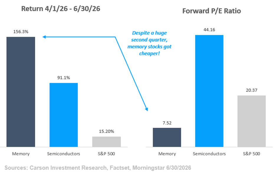
From the macro to the market’s favorite subject: AI. Grant Engelbart, VP, Investment Strategy & Research, found the corner of the trade where things got a little wild in the second quarter:
“The AI trade and the expected impact surrounding its growth continue to create huge winners and losers, and even several winners that have become losers and vice versa. One microcosm of this phenomenon has played out in the second quarter alone. Surging AI server demand, which relies on specialized memory at a time when that memory is scarce, has created a large supply/demand imbalance that has propelled a subset of stocks substantially higher. On top of this, future demand expectations and pricing power are so high that earnings expectations have increased even more than prices, in many cases causing P/E ratios for stocks in that space to fall.
Traditional semiconductors, which have had a great run of their own, trade at 44x the next 12 months’ earnings, versus just 7x for memory stocks (which are typically classified as semiconductors)!”
When What You Think You Know, Just Ain’t So
But every winner in the AI trade seems to come with a loser attached. Blake Anderson, Director, Portfolio Management, picked the chart that flipped a decade of conventional wisdom on its head:
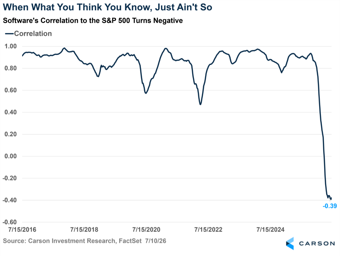
“What software investors thought they knew coming into the year proved to not be so: The industry’s correlation to the broader market has gone negative! For the past decade, the software industry has traded with a high and tight correlation to the S&P 500, spending most of the time above a correlation of 0.8 (on a scale of -1 to +1). Put differently, it was a pretty safe bet over the last decade that software stocks would move in a similar direction to the S&P 500.
But that just ain’t so in 2026! Software entered 2026 with a 52-week correlation to the S&P 500 of 0.85. That correlation has plummeted to minus-0.39! Software is down as the market is up, bucking the trend of the last decade. This breakdown comes as investors perceive that semiconductors—the market’s darlings so far in 2026, as Grant showed above—are eating software alive.”
Earnings Grew a Lot Faster Than Sales
The last one comes from Harry McDonald, Analyst, Investment Research. The headline from Q1 earnings season was that earnings were strong, but his favorite chart of the first half shows why they were strong, which might be a little more interesting:
“Eight of the 11 S&P 500 sectors grew earnings faster than revenue, and in some cases, it wasn’t even close. Info Tech grew EPS 54.8% on 31.9% revenue growth. Communication Services nearly hit 49% EPS growth on 15% sales growth. Materials grew earnings at more than four times the pace of its top line.
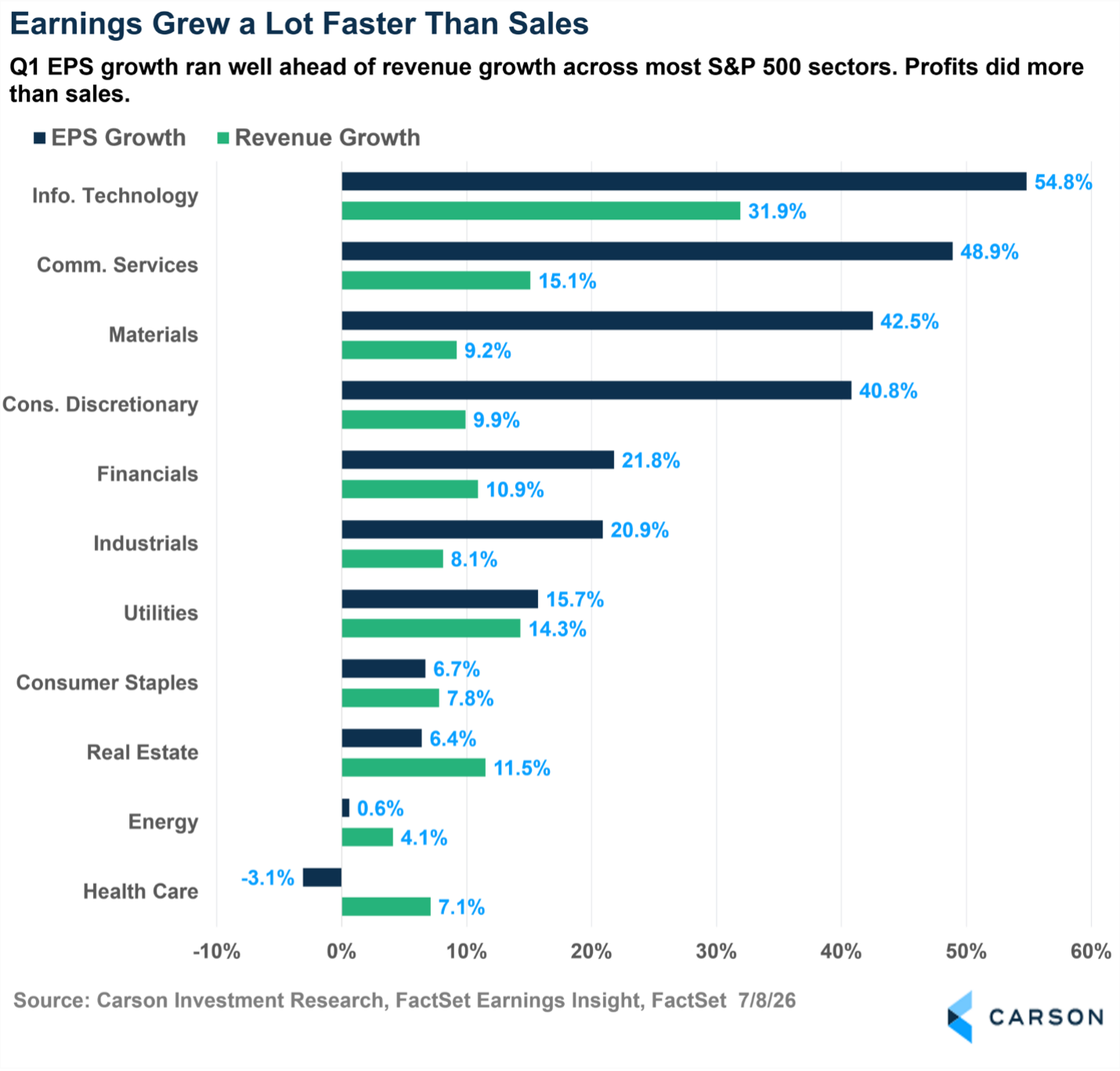
When profits outrun sales like this, it means this isn’t only about demand—it’s about what happened between the top and bottom lines. Margins expanded, buybacks shrank share counts, and some sectors were lapping a soft stretch a year ago. Whatever the mix, corporate America squeezed a lot of profit out of every dollar of sales in the first quarter.
However, the other side matters, too. Health Care grew revenue by 7% while earnings actually fell. Selling more and earning less is the toughest spot in business, and it’s a reminder that this earnings strength, while broad, wasn’t universal.”
Wrapping It Up
Six charts, one overall theme: The market spent the first half of 2026 rewriting the rules everyone thought they understood. Software stopped tracking the index, oil stopped driving the inflation narrative, and the AI trade kept finding brand new winners. Meanwhile, the index itself just did what it usually does: climbed a wall of worry, up more than 10% at the half.
If the first six months taught us anything, it’s that the consensus view has a short shelf life in this market, but staying diversified can still help capture a meaningful proportion of positive surprises. We’ll be watching all of these stories closely in the second half.
The AI Wave Is Everywhere, Even in Small Caps
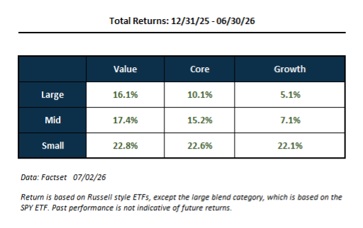
You would think AI is a growth story, but it’s showing up in more places than in the obvious “large cap growth” stocks. Even so-called “value” stocks have seen returns driven by the AI wave. Looking at style box returns for the first half of the year, you can see that large value has beaten large growth (a function of the Mag 7 underperforming), but also that mid and small cap stocks have outperformed the S&P 500. The Russell 2000 index gained about 23% over the first half, versus 10% for the S&P 500. That’s a big difference, and it’s easy to look at that and think recent market gains are more than just AI (which, on the surface, is all about large-cap semiconductor stocks). But think again.
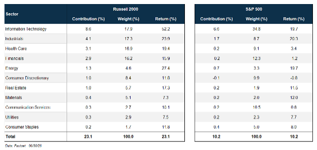
We looked at the attribution of first-half returns for the Russell 2000 by sector. Usually, small caps are dominated by financials and healthcare. Together, they make up 33% of the basket. Technology, the largest sector, makes up almost 18% of the basket. That’s not as high as in the S&P 500 (35% weight), but it’s still significant. Still, the contributions from the technology sector make up a large part of the Russell 2000’s first-half return, as it did for the S&P 500:
- Technology stocks in the Russell 2000 gained 52.0% (weighted average), contributing 8.6 percentage points to the index return of 23.1% (37% of the total return).
- Technology stocks within the S&P 500 index gained 19.7% (weighted average), contributing 6.6 percentage points to the index return of 10.2% (65% of the total return).
The next largest contributor for the Russell 2000 and the S&P 500 is the industrials sector—adding 4.1 percentage points to the former and 1.7 percentage points to the latter. Interestingly, the weighted average return for every sector in the Russell 2000 is positive, and in all but two sectors (materials and utilities), the returns are higher than the corresponding sector return in the S&P 500.
That’s the sector view, and by itself, you’d think tech directly ties in with the AI story. However, we thought it would be interesting to do a deeper dive on how much of the Russell 2000’s first half return was tied to AI. We used a couple of approaches:
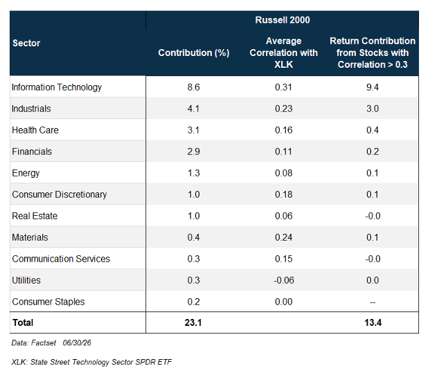
- A quantitative approach, where we looked at the correlation of all the stocks in the Russell 2000 index with the S&P 500 Technology Sector Index over the past year, and added the return contribution from stocks with a significant correlation to technology (greater than 0.3).
- A qualitative approach, where we used an AI engine (LLM) to tell us whether every company in the index is tied to AI in some significant way.
The table below shows results from the quantitative approach, i.e., using the correlation to large-cap technology sector. We’ve included the sector contributions to overall return and the average correlations of all the stocks within each sector with the technology index for reference. As you may expect, technology makes a large contribution from stocks with a significant correlation with the technology index (9.4 percentage points). However, small cap industrial stocks that have a significant correlation with technology contributed another 3.0 percentage points to the Russell 2000’s first-half return. Add in contributions from companies in other sectors that are correlated to technology, and you get a total of 13.4 percentage points from tech-correlated companies, i.e., 58% of the total return of 23.1%.
You could argue that large cap tech is not an accurate enough proxy for AI. That’s why we thought it would be interesting to corroborate the above results with the second approach: using an AI engine to obtain a more qualitative assessment of whether each stock within the Russell 2000 index is tied to AI. The table below shows the weight of each sector within the Russell 2000, the weight tied to AI, as well as the return contribution from those stocks tied to AI. A few observations:
- Based on this approach, 24% of the Russell 2000 index is tied to AI.
- 52% of the total first-half return of the Russell 2000 (12.1 percentage points out of 23.1%) comes from companies tied to AI.
- Beyond technology, industrials have a significant portion of companies tied to AI.
- The fact that AI-exposed stocks contributed over half the return despite making up just a quarter of the index tells you that returns for these companies are much larger than companies not tied to AI, telling the same story as the quantitative approach.
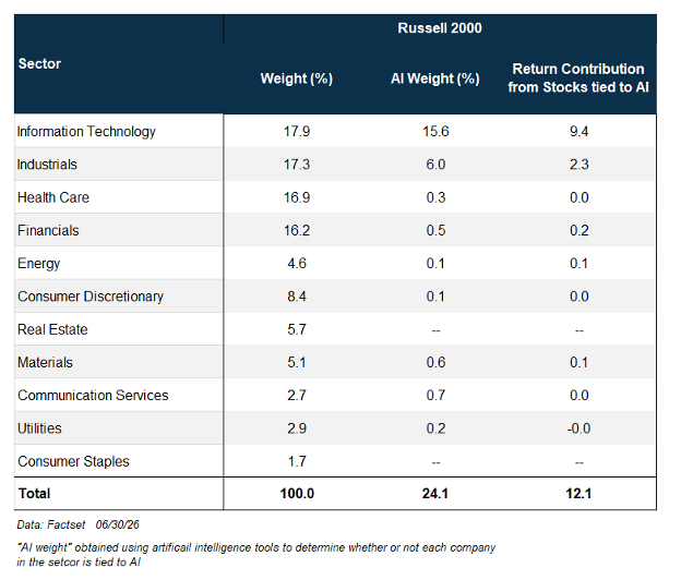
The big picture is that over half the first-half return for the Russell 2000 is tied to AI, irrespective of which approach you take. The AI wave showed up in a big way even outside of large cap chip stocks in the first half of 2026. That doesn’t mean other sectors (even within the Russell 2000) didn’t do well. They did. But the analysis highlights that stocks tied to the AI wave made contributions well beyond the technology sector. That matters for portfolio diversification, especially if the AI wave were to crash. Using size, sector, style, or region alone won’t tell you what your AI exposure is, whether you want the exposure or are trying to avoid it. AI is everywhere.
S&P 500 — A capitalization-weighted index of 500 stocks designed to measure performance of the broad domestic economy through changes in the aggregate market value of 500 stocks representing all major industries.
The NASDAQ 100 Index is a stock index of the 100 largest companies by market capitalization traded on NASDAQ Stock Market. The NASDAQ 100 Index includes publicly traded companies from most sectors in the global economy, the major exception being financial services.
The views stated in this letter are not necessarily the opinion of Cetera Wealth Services LLC and should not be construed directly or indirectly as an offer to buy or sell any securities mentioned herein. Investors cannot invest directly in indexes. The performance of any index is not indicative of the performance of any investment and does not take into account the effects of inflation and the fees and expenses associated with investing.
A diversified portfolio does not assure a profit or protect against loss in a declining market.
All investing involves risk, including the possible loss of principal. There is no assurance that any investment strategy will be successful. This information is from sources believed
9019344.1-0726-C
